
RESEARCH | INTERACTION DESIGN | UI | BRANDING | LOGO | USABILITY TESTING
CHALLENGE
Research and design a responsive website for a fictional time travel agency, Zeit. The site needed to be equipped for travelers to search, filter, customize, and book their trip of a lifetime. The responsive website was researched and designed in 6 weeks.
SOLUTION
A dynamic, easy to use, responsive website and custom branding for the world’s first time travel agency. Travelers can easily search for trips that fit their interests and discover new adventures.
BACKGROUND
The most innovative and exciting travel opportunity in modern history is finally here: time travel is a reality. Zeit has pioneered the use of time travel in the commercial market, making this incredible experience available to the world for the first time. Zeit needs a responsive website for customers to discover and find their dream vacation to the past.
The website should be focused on users finding and booking their trip, so e-commerce capabilities are a must. As specified in Zeit’s project brief, the Zeit user should be able to browse “trip categories and details, filtering via interests and classifications.”
The secondary design goal is to design a logo for the company that was both “modern and historical at the same time.” Given Zeit’s innovative use of technology and their ability to bring customers to many points in history, they specified that the logo should reflect “modern technology with a link to the deep past.”
Research & Empathize
MARKET COMPARATIVE ANALYSIS, USER INTERVIEWS, STORYBOARD, USER PERSONA
I began my research into market competition by looking at luxury travel companies who offer a similar travel package model and a tailored experience, similar to Zeit. By researching companies such as Geo Ex, G Adventures, and Space X, I uncovered several insights.
Travelers are increasingly seeking unique experiences and adventures to enrich their trip, not content just to visit the destination. Travel companies seek a personal connectivity with their users, providing support before, during, and after the trip. Travel is closely associated with social status through posting on social media. And for customers who choose luxury travel, one of their top priorities is having “experiences that give me new perspective on the world.”
USER INTERVIEWS
I conducted user interviews to identify insights and pinpoint users' goals and needs, and uncover their behaviors, fears, frustrations, and pain points around booking and travel experiences. I spoke with 5 users and asked them questions about reasons for traveling, their process around planning and booking a trip, what experiences make a trip meaningful, and what online services they prefer when planning a trip or vacation. I summarized each interview with demographic information, a brief highlight, and goals and pain points:
User is 30 years old, male, and travels 2-3 times a year. He uses Google as a jumping off point for planning, using it for cultural research about a potential destination. He’ll then look for travel dates based on flight deals, and see what time of year is best for that destination, for example, if the off season is cheaper what kind of deals he can get. His priorities in booking are a simple, easy to use interface, excellent customer service, and language accessibility. His pain points are finding affordable flights that align with desired dates, and poor customer service with airlines.
After synthesizing my interview data through an Empathy Map, I identified three key insights.
Users have trust in their preferred travel websites.
Users want spontaneity and flexibility in their travel.
Users like to have a variety of experiences available in their trip.
From these, I moved forward with three key needs in mind: users need to have an established trust in their website, users need a travel package that offers flexibility each day, and users need to be able to make choices during their vacation.
STORYBOARD & USER PERSONA
Sketching a Storyboard allowed me to think about how the user might discover Zeit, the starting point at which they might access the homepage, and what their potential goals are in using Zeit. I further explored the user’s motivations, goals, needs, and frustrations with the development of a persona, Madeline.
Madeline wants to travel with friends or family, a flexible vacation schedule that allows for spontaneity, and inexpensive package options that give her a great deal for her money. Her frustrations are knowing where to even start planning - what’s the best time of year to get a good deal? What packages are available that will be right for her? She doesn’t want to be restricted when she chooses a trip; she needs an element of discovery in her day.
Define, Ideate, and Organize
BUSINESS & USER GOALS, PRODUCT FEATURE ROADMAP, CARD SORT, SITE MAP
With the business goals from the project brief and the user goals from my persona now defined through research, I moved into ideating feature solutions that would respond to these goals. I created a product roadmap to list and prioritize the features that would support business and user goals. I included research data supporting it, and prioritized the design features based on necessity first, and moved into “surprising and delightful,” as well as future possibilities. While I didn’t end up using all of these feature ideas, it was a useful part of the process for generating ideas freely.
Knowing that search filters were a vital part of users being able to navigate the trip options on Zeit and customize their trip, I used a couple of methods to diagram the site’s information architecture.
I ran an open card sort with 30 cards, each card showing a potential destination offered by Zeit.
Users created many different names of categories to sort their cards, but from these categories I traced patterns of organizing into Events, Interests, and Eras. From this data, I concluded that broad categories need to be available on the site for users to explore, but a search option and good filters and tags are needed to customize user trip booking experience.
I then created a Site Map to map the features and pages needed, using information from the product roadmap and results summarized from the card sort activity.
Design & Prototype
SKETCHING ON PAPER, USER FLOW, TASK FLOW, MARVEL POP PROTOTYPE, MID-FIDELITY WIREFRAMES IN SKETCH
With a strong foundation of research, a plan for priority features, and site layout, it was time to design Zeit’s responsive homepage. I began by making some rough sketches on paper for the desktop design. To think more clearly about the mobile design, I used Prototyping on Paper (POP) by Marvel to make a sketch mobile prototype. See the POP prototype here.


I created a user flow and task flow, thinking about several scenarios of user flows, including entry point and goals in navigation.
I moved into Sketch for creating mid-fidelity wireframes. My first versions were annotated with descriptions of each part of the page design. After receiving initial feedback, I revised the wireframes. For Zeit’s responsive website, I designed the desktop version first, as this allowed me to fully consider the technical needs and layout of a travel website that would display many options for users to discover and book their time travel destination. Responsive wireframes for iPad and iPhone 8 were designed next.


Logo & Branding
MOOD BOARD, SKETCHING ON PAPER, WORDMARK & LOGO DESIGN, STYLE TILE
To design Zeit's logo, I began by identifying the brand attributes that would best represent the company. I made a list of words that describe Zeit’s services, direction, and brand, and narrowed the list down.
I started designing the logo by making several sketches based on ideas around classical and modern designs, time, and flow. I created a number of logo options before settling on a logo which best represented the dual flow of time that Zeit has harnessed.
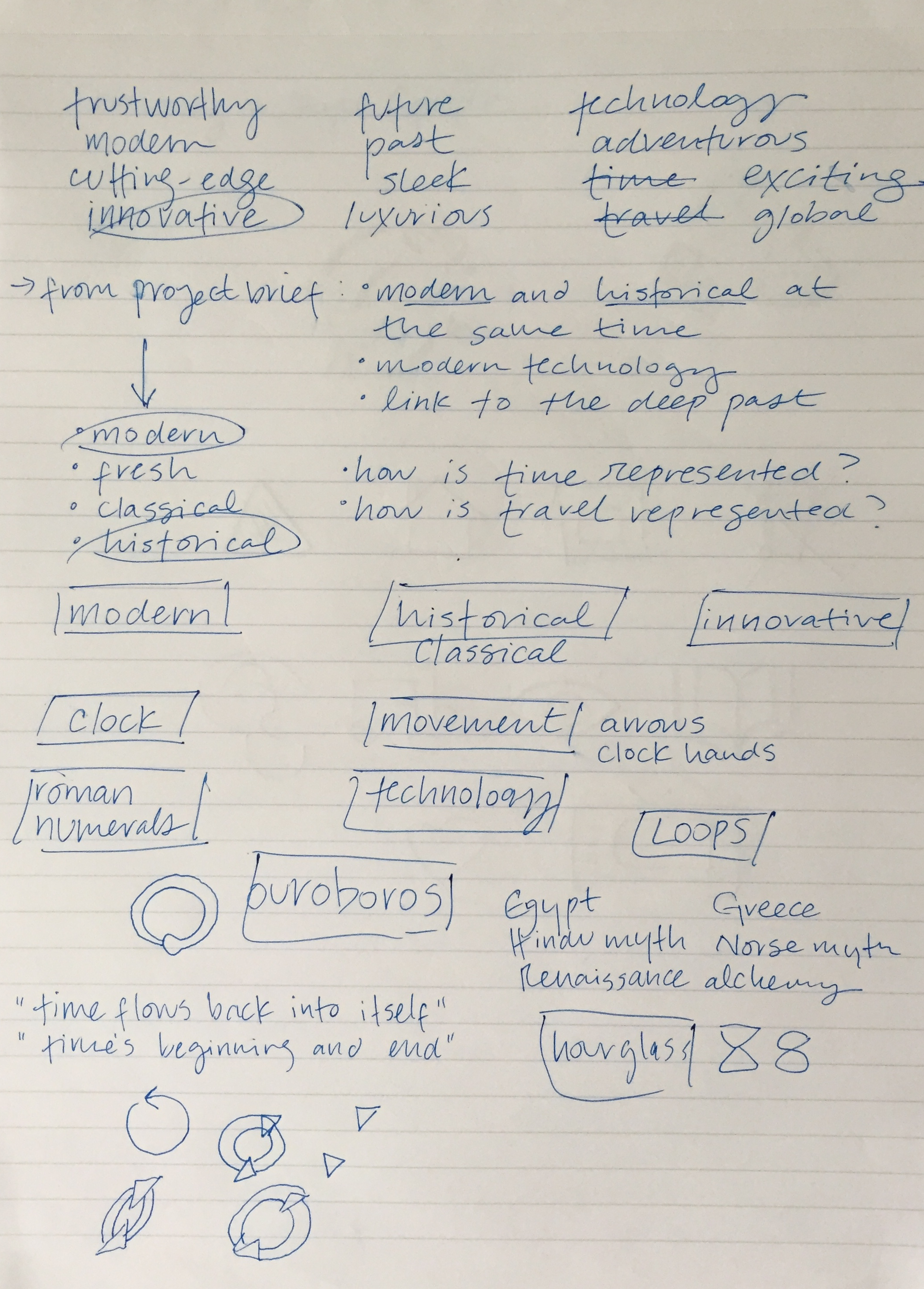


After finalizing the logo design in greyscale, I added color, and created versions with and without the Zeit wordmark. I made sure that the logo would scale properly for responsive design purposes. In preparation for high fidelity wireframes, I compiled a style tile with design elements including typography, color palette, images, and form fields in one document.
High fidelity responsive wireframes for desktop were finished first for testing. Designs for iPad and iPhone 8 were then created.
High Fidelity Responsive Wireframes
WIREFRAMES FOR DESKTOP, IPAD, AND IPHONE
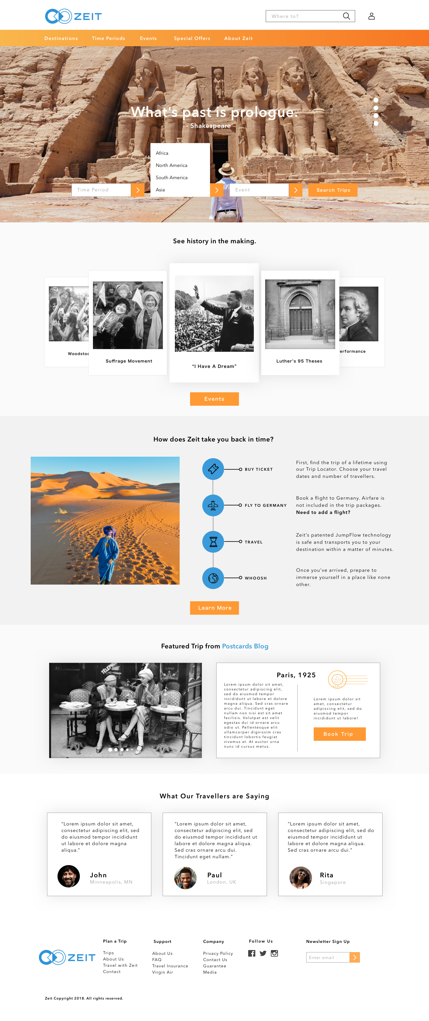
I designed the Zeit homepage with fully responsive wireframes, as seen below. For time and testing, the desktop design was more fully fleshed out with about 15 screens to correspond to user flows.


These high fidelity wireframes were created for the desktop prototype created for user testing. The InVision prototype is archived, please contact me if you’d like to view.


Testing & UI
REMOTE & IN-PERSON USABILITY TESTING, INVISION PROTOTYPE, UI KIT

I performed usability testing for the Zeit website with five users. Tests were conducted in person, and two were conducted remotely through screen sharing, while the user described their process and what they were seeing. After testing with five people, I saw some patterns emerge that gave me more insight into the user’s point of view.
A feature on Zeit’s homepage that I’d spent a great deal of time perfecting was an interactive timeline, which allowed users to navigate horizontally through centuries and eras, seeing all the events that were available to travel to with thumbnail images. While my mentor had cautioned me that such a feature presented potential technical challenges, I felt that it would be a visually compelling way to draw users into exploring all that Zeit had to offer. My usability tests showed me that this was definitely not the case! Not only did users gravitate towards other methods of looking for trips, some ignored the timeline feature altogether. It was clear that the feature wasn’t enticing users at all, it was confusing them.
I synthesized the insights and patterns I’d seen in usability testing with an affinity map, representing each of the testers’ experiences and remarks with color coded notes. I decided to: simplify the search elements by removing the timeline, to improve notifications that gave users confirmation and feedback on actions, and change the hierarchy of the homepage so that users could more readily learn about the company’s booking and travel process.

After making final revisions to the wireframes, I finalized a UI kit for handoff containing all of the site elements including color hex codes, form fields, and icons.
Creating a UI Kit from scratch ensured that I thought carefully about each of the site’s design elements and how to thoughtfully hand them off to team members in future projects.
Summary & Takeaway
Creating a responsive website design for Zeit challenged me to work deeply with different research methodologies. Since time travel doesn’t exist at the time of this writing, the project research wasn’t about asking users “would you time travel?” Rather, I was focused on building a strong brand and user experience for a travel company that offers travelers an incredible opportunity.
I focused on research, information architecture, user flows, and a vibrant, engaging UI that made discovering and booking trips compelling and intuitive. Building trust with the Zeit brand was a priority, as was the overall user experience of using the website on multiple platforms. Designing a logo that communicated strength, integrity, and the flow of time was a part of ensuring that experience, as well as making it easy for users to search by time periods and interests, so that every user felt there was a trip for them available through Zeit.
Given more time, I’d test my designs again, and continue improving on the features that make the Zeit website not only useful and accessible but delightful and inspire people to keep exploring and enrich their experience of the world.