

RESEARCH | UI | INTERACTION DESIGN | BRANDING
CHALLENGE
Loaf, a small bakery focused on artisan wood-fired breads and European-style pastries located in Durham, NC, needs a responsive website where customers can learn about the business, how they can visit, and peruse the menu online. Customers will be able to see the day’s offerings and find out how to make a special order. The project timeline was 3 weeks.
SOLUTION
A responsive website designed in iOS that showcases Loaf’s commitment to quality and fresh, organic ingredients, provides customers with a mouthwatering preview of their complete menu selection, and provides vital information like how and when to visit and how to place a special order.
BACKGROUND
Loaf Bakery began as a farmer’s market outfit, peddling fresh bread and pastries at weekend markets around Durham, North Carolina. They opened a brick and mortar shop in 2011, located in downtown Durham. They’ve earned rave reviews for their baked goods from Bon Appetit and the New York Times, and have a devoted customer base who visit their shop or farmer’s market stands weekly. Loaf doesn’t currently have a website, instead relying on social media including Twitter, Instagram, and Facebook to tell customers about today’s fresh pastry selection.
Research & Empathize
MARKET COMPARATIVE ANALYSIS, PROVISIONAL PERSONAS, USER INTERVIEWS, EMPATHY MAP
I began my research by looking at independent bakery market trends, which helped me understand the national market and begin thinking about Loaf’s target market. I then researched local market competition, and looked at the websites and customer reviews through sites like Yelp, for Loaf’s direct and indirect competitors. In researching the U.S. independent bakery market, I highlighted a few trends:
Presenting products attractively, in a clean, well-lit case, will help foods sell themselves.
Community building is a top priority.
Bread is a top seller and represents a key sector of market needs.
In order to reach a larger audience, bakeries may need to offer options that are gluten-free, vegan, or paleo.
I looked at five area competitors of Loaf. Loaf’s 3 direct competitors are bakery/cafe spots that are in close proximity, have a focus on European pastries, and fresh bread. In a strange twist, Scratch closed its doors a mere day after I wrote this analysis! Loaf’s indirect competitors have a focus on breakfast food or specialty cakes, but are located within a couple of miles of Loaf’s downtown bakery and still have a slice of the business pie, so to speak.
Based on this research, I developed a set of provisional personas. These profiles represent Loaf’s customer base, and help me to begin thinking about customer needs, goals, and assumptions to test.
USER INTERVIEWS
To better understand Loaf’s customers’ needs, goals, and frustrations, I spoke to them directly. I spent a Saturday morning at the bakery observing the flow of traffic, the items for sale, layout of the shop, and talking with the owner and staff. I conducted several interviews in the bakery with customers who had stopped in, and spoke to them about their experiences with Loaf.
“Beautiful pastries. I don’t need a blueberry red velvet cake, but now I want it!”
“The food is high quality, there’s no lingering or lines, the service is friendly, and you can get in and get out.”
“My favorite thing about Loaf is having it be part of my local community.”
I also spent time talking with Loaf’s owner about the business and what he thought a website could do for them. He was happy with using social media to get the word out to customers about fresh treats and seasonal specials, but agreed that a website could be a good place to keep their menu. I mentioned that it had been a little hard to find their baking schedule on the Facebook page - the bakery offers a rotating selection of breads each day, and some customers might not know that what they picked up yesterday won’t be available the next day. The owner also mentioned that since the bakery is a very small space, they don’t have the capability to keep a computer behind the counter, so any special orders need to be placed over the phone. I added these concerns to my brief of business goals.
Following interviews, I gathered all my notes and created an empathy map to understand patterns around customer needs, goals, frustrations, and behaviors. From these, I was able to infer insights that led to identifying customer needs. These needs served as a navigation point for my work going forward.
User needs reassurance that no matter what they choose at Loaf, they won't be disappointed in the quality.
User needs to be able to anticipate what they can choose, no matter when they visit.
User needs to feel that the commitment to a local business enriches the community.
I developed a user persona, Mira Fisher, around the needs I had identified through my primary research. Mira needs to be able to anticipate what will be in stock any time she visits Loaf. She feels that her commitment to a local business enriches her community. And Mira needs to feel reassured that no matter what she chooses to enjoy at Loaf, there won’t be a compromise on quality.
Defining Goals & Brainstorming
POV STATEMENTS AND HMW QUESTIONS, BUSINESS & USER GOAL CHART, PRODUCT ROADMAP
I moved into reframing Mira’s needs as design problems by generating a set of Point of View statements and “How Might We?” questions that led into brainstorming ideas that respond to user needs. I quickly brainstormed ideas by setting a timer for each question, and quickly generating ideas that would respond to these goals.
With user goals and needs established through research, I created a chart where Loaf’s business goals, the user’s goals, and technical considerations were gathered in one place, and identified where the goals intersected. By focusing on these overlapping goals, I was able to create a Product Roadmap.
To clarify the ideas generated during brainstorming, I listed priority features in the roadmap. I now had a plan to move forward with the site's goals and priorities in mind. Metrics were added to track the features' usability.
Design & Prototyping
SITEMAP, USER FLOW, TASK FLOW, SKETCHES ON PAPER, WIREFRAMES IN SKETCH
With a clear direction based on user research in place, I laid the foundation for the Loaf website by first defining its architecture. I created a sitemap showing necessary pages, and a user flow that examined the steps a user might take to navigate the website, including the starting points and goals of different users. A task flow also helped show the path of user choices from entry point to task fulfillment.
Time to sketch! After quickly generating some low-fidelity responsive wireframe sketches, I turned to creating these mid-fidelity wireframes in Sketch. I created the site's essential pages, drawing from my user flows, sitemap, and research, in preparation for user testing. The desktop pages included: Home, Menu, About, Contact, Baking Schedule, and Breads.


User Testing
PROTOTYPE IN INVISION, AFFINITY MAP
After completing my mid-fidelity wireframes, I plugged them into InVision and created a prototype for user testing. I tested the prototype with three users who lived in the Durham area and were familiar with Loaf. I asked them to complete a couple of tasks in order to test navigating the website.
"You’re new in town and heard that Loaf is one of the best bakeries around. You’d like to visit the bakery sometime tomorrow, so you go to the website to find out their hours, days they are open, and what their menu offerings are. You decide on a loaf of bread that you like and find out how to have the bakery hold it for you."
Through usability testing the prototype, a few patterns quickly emerged. I had a major assumption tested and disproved here! I had included the bakery’s address and store hours in the footer of the site, believing that this was a common design pattern to which users would navigate naturally. Instead, every user selected About from the nav bar when asked to find the bakery’s information. It was clear that this information needed to go there too! Users also assumed that the site would be an e-commerce setup where it was possible to place orders and pay online. When they clicked on thumbnail images of breads, they didn’t receive any feedback from the site. The message that the bakery would only take orders over the phone needed to be more prominently featured.
After summarizing my notes, I created an affinity map to show exactly how the patterns and pains of users led to valuable insights that I could use to revise my prototype. The InVision prototype is archived at the moment - please contact me if you’d like to see it.
Branding & UI
MOODBOARD, STYLE TILE, HIGH FIDELITY RESPONSIVE WIREFRAMES IN SKETCH, UI KIT
After making priority revisions based on insights from user testing, I was ready to re-envision the Loaf website with refreshed branding, color palette, and images to complete the responsive design. Loaf wished to maintain their logo for visibility, and color accents on the site used the deep red associated with their branding.
I created a moodboard with an ideal color palette, typography options, and adjectives associated with Loaf and their brand. A further refined style tile gathered the typography choices, logos, color palette, and some of the images for the site in one document. Having defined Loaf's refreshed branding and gathered images to express their commitment to quality through good food, I updated the wireframes into high fidelity designs.


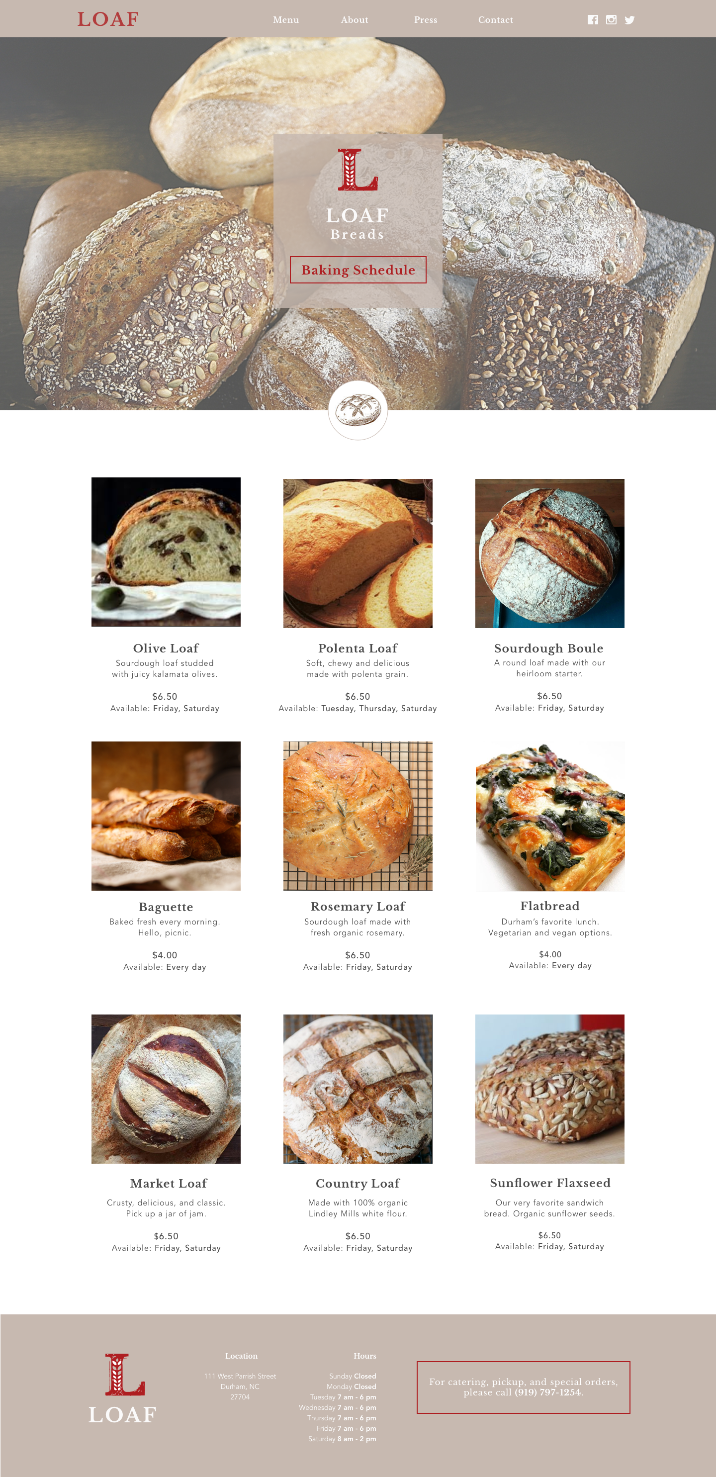


I designed the Loaf website on desktop first, for usability testing. After finalizing the designs, I created the responsive counterparts for each screen.


Summary & Takeaway
Given more time, I'd test the prototype again with new users and make revisions to the design based on their feedback. Currently, Loaf doesn't take orders online, but if they were to change this model, I'd gladly take on the challenge of designing a more e-commerce centered website for them.
During this process, I worked with Loaf's business goals and user goals identified through research. I set priorities and brainstormed features based on these goals, sketched my ideas, and created basic responsive designs. I created a prototype for users to test, then improved the prototype further. I created a user interface that showed refreshed branding for Loaf while maintaining their logo, and developed a website design that is responsive across platforms.